Morten Olsen
Be My Quiet Friend
Dacapo Records, 2013
Indefiniteness
Morten Olsen had been working on his songs for Be My Quiet Friend for a long time. He had been through an epic composing process that had lasted over ten years.
The music evades genre – he uses jazz-like improvised moments, but edits the pieces together with meticulous care. The text for the music was put together as fragments too. In the liner notes, Danish musician and writer Kristian Leth remarks that Olsen ‘…picked a line here, two lines there, and put them together. Precisely with the aim of not letting them point to any single meaning. And precisely in the clear awareness that as soon as the composer himself began to sense a narrative or a point, then he had to turn the other way.’
Reading the song texts, I was struck by the colourful imagery: yellow fish, birds in trees, green nailpolish, tranquillisers, marbles, shoeboxes, moons. I tried to float these colourful objects together in a random, surreal way. Morten found the design too literal, too readable. He wanted it more ‘blurry and unclear’.
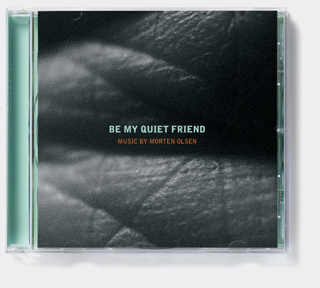
In my next attempt at the cover, I took a grainy, black and white image of the bottom of my own foot, very close up. The marks and folds of the skin were somewhat recognisable, but the image itself seemed hard to pin down. I thought it worked well with the intimate title. Still thinking of all the colours in the text, I put the title in large, coloured letters across the cover. Morten liked the individual parts but was unhappy with the overall effect. ‘I am very aware that I got everything I asked for after the last version, but I don’t really feel the connection to the music, neither its emotional content (whatever that might be…) nor the aesthetics of it… Maybe it was wrong asking for it to be blurry or unclear, maybe I should have said in-understandable.’
I went back to the objects and played with abstracting them, reflecting them on multiple axes, to create surreal, floating shapes that defied recognition – but this, too, failed to resonate with Morten. We were running out of time. He suggested that we keep the typography from the third design and I combined it with the image from the second design. Though I sensed he would have liked to have more time to play with it, this solution became the final artwork.
A year later, Morten reflected that perhaps the first design with the yellow fish had been interesting after all. ‘…no matter how hard you try to do the final composition, the final mix, the final cover or whatever – it will always be a frozen snapshot of where the process ended.’