Dana Jessen
Carve
Innova Recordings, 2017
Trailcutter
Dana Jessen approached me to design her release Carve, which she was commissioning, performing and producing herself. Dana is the kind of experimental, entrepreneurial artist that I love. She doesn’t sit around waiting for great pieces of music to be written for her instrument, she finds exciting ways to commission and create new pieces herself. She was the driving force behind commissioning Rushes from Michael Gordon, which is how I got to know of her.
Dana’s instrument is the bassoon – traditionally considered a humorous or ‘grandfatherly’ instrument (it famously has the role of grandfather in Prokofiev’s Peter and the Wolf) – but Dana will blow, talk, even spit into her mouthpiece in order to create a new, emotional language for the bassoon.
For Carve, she commissioned four new works for bassoon and electronics by Sam Pluta, Paula Matthusen, Peter V. Swendsen, and Kyle Bruckmann. She also improvised the interludes between the works herself. Improvisation is a key element that ties the pieces on the album together: ‘When I approached each composer for this project, my focus was not only new compositions for bassoon and electronics, but to commission compositions that reflected my work as an improviser. So each piece either provides space for improvisation or includes some Dana-specific techniques that I have developed over the years as an improviser.’
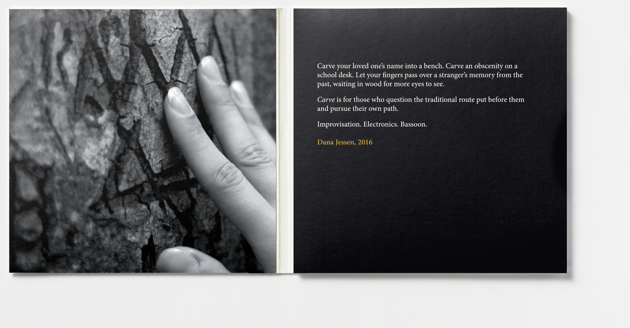
Personal language turned out to be a key principle for the design of the artwork. Before we had started the design process, Dana had written a small piece of text – a personal statement – that she wanted to have up-front on the album: ‘Carve your loved one’s name into a bench. Carve an obscenity on a school desk. Let your fingers pass over a stranger’s memory from the past, waiting in wood for more eyes to see. Carve is for those who question the traditional route put before them and pursue their own path. Improvisation. Electronics. Bassoon.’
Her text created a new kind of problem for me. My own rule of thumb when making cover artwork is to avoid being too literal – don’t try to directly illustrate the title but try instead to create a friction between the words and the image because that’s how you make people curious. But Dana’s personal statement was already full of images and as soon as I tried to work against it, the results became incongruous instead of interesting.
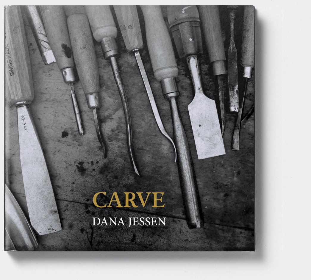
After some experimentation with knives and other cutting instruments, we settled on carving tools as a motif. The image of wood-cutting tools on the cover was found on Flikr, one of my absolute favourite image resources and an insane treasure trove for image scavengers like me. The image of a female hand touching a carved tree trunk was an even more literal illustration of Dana’s text, ‘Let your fingers pass over a stranger’s memory from the past, waiting in wood for more eyes to see…’
I learnt that illustrating the title is not always a lazy choice. My role as a designer had been to support Dana’s vision, to unfold her text visually rather than come up with an approach of my own.

