Introduction
Towards the full square
In 2003, by chance, I began working freelance for Dacapo Records – Denmark’s National Recording Label – designing CD covers for their ever-growing catalogue of classical music. I was an untrained graphic designer and a music novice, not to mention a foreigner in Copenhagen.
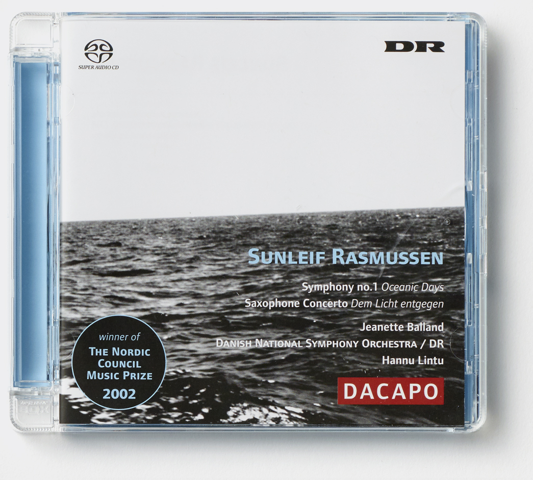
The world of classical music was totally alien to me. The culture confused me. The aesthetics of the presentation confused me even more. Prior to my arrival at the label, Dacapo decorated their covers in a strict format of bright red frame, old painting, centralised serif type and logos in all corners. Partially subsidised by the Danish state, the mission of this small label was to record an authoritative archive of Danish classical music. All funds went into the music production and very few resources were put into the visual presentation of the music – which was not at all unusual for a small classical music label at that time.
Dacapo’s production was pretty big though. From the start, we were producing around 25 CDs a year – both historical and contemporary works. There was no budget for pictures so I had to make or find all the imagery myself. Luckily, I had always taken a lot of pictures and I wasn’t averse to drawing or printing my own material.
I hated having to put a big logo on all the covers, but all the other classical music labels did it, so we had to do it too. Logos were not the only requirement. There was also a lot of information to get on those CD covers: Composer, Work Titles, Soloists and Ensembles. Sometimes the whole cover would be covered in text and logos.
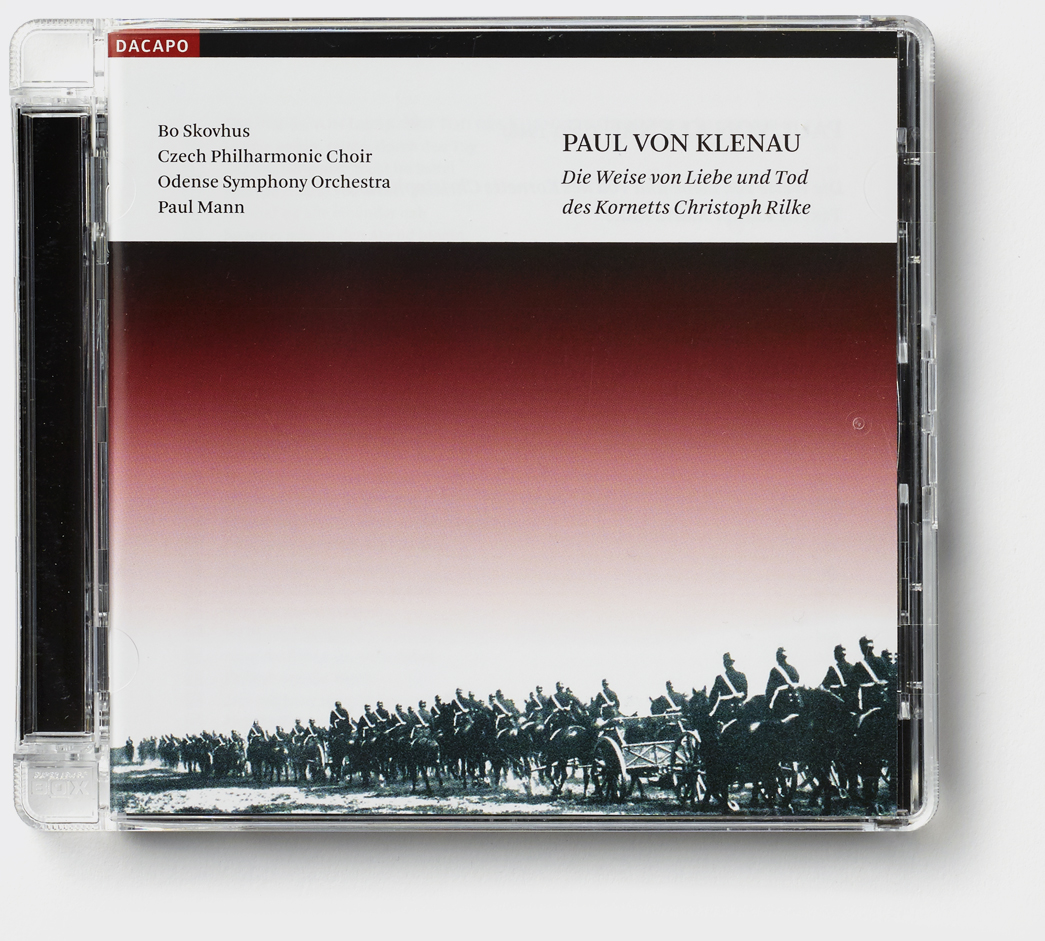
I struggled with how to make room for all that information. I decided, in 2006, that my solution would be to separate the pictures from the text by making a template with a white area at the top of the cover that could hold all the text and frame a much-diminished version of the logo. Having a house-style like this meant I didn’t have to think about the type and could just concentrate on the pictures.
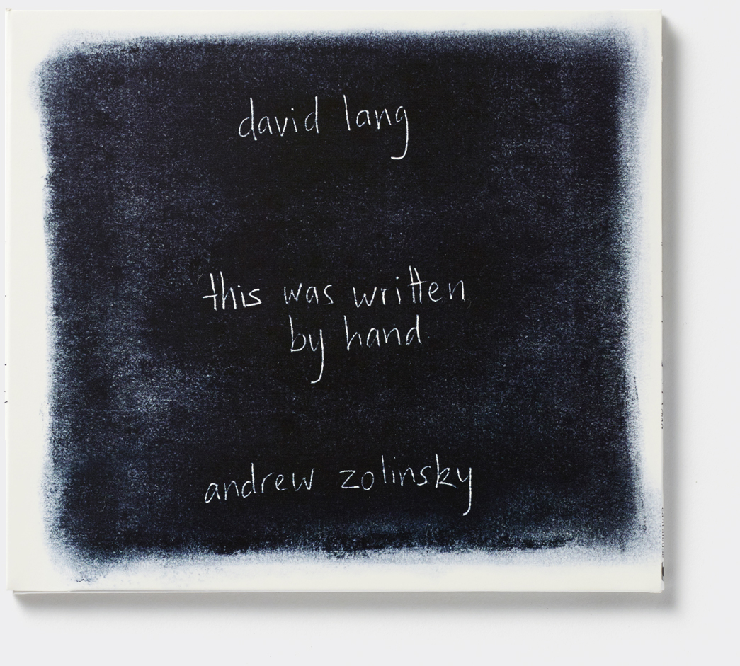
In 2008, I got the opportunity to meet with American composer David Lang while he was visiting Copenhagen. I showed him some of the CDs I had been making. Wouldn’t it be great, he remarked, if one day the label would let me use the whole cover space. I was too embarrassed to tell him that it had been my own idea to use the boring template.
I resolved to pull myself together and conquer the whole CD cover.
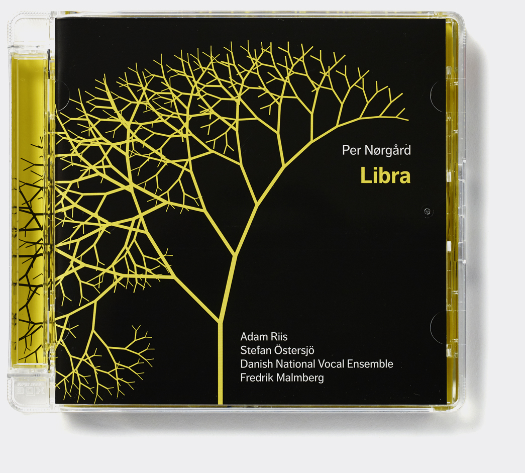
My gentle pressure on Dacapo to drop the logo on the cover eventually succeeded in 2010. Being allowed to redefine the cover from a marketing space to an artistic space marked a significant breakthrough.
Hand-in-hand with my newly dawning realisation that the assignment was about finding a way to put the ideas behind the music in focus, the little square of the CD cover became a much more exciting and rewarding space to fill. My collaboration with Dacapo continued and I began to work for other labels such as Cantaloupe Music in New York.
My adventures in new music had really begun.
Read stories from beginning or see an overview of featured stories below.


An early cover from my first years designing for Dacapo Records – composer name, list of works, and artists along with a logo in each corner and a even a 'sticker' announcing a prize for the composer were requirements for the cover.

The 'white area' template I developed to harness all the information. Dacapo's own logo has become very small and part of the frame and I can seperate text and image elements.
