Preface
Notes from the designer
Just because I’m a graphic designer working with art music, don’t think that I’m an expert in classical music. I’m a graphic designer for a reason – my tendency is towards visual things.
I came to work with this genre by chance, having no knowledge or real experience of it. My lack of music education made me timid, so for many years I accepted that the graphics were just a superficial part in the process of publishing music. As I began to get to know the composers and musicians, I realised that I was missing out on an incredible opportunity to work with great artists. I started to engage with the ideas behind the music.
These days when I make a design for a release, I have a conversation with the composer or artists involved – if that’s possible – and ask lots of questions. Art music is often based on complex ideas and it’s important to get a good understanding of them in order to make a meaningful design. At the same time, my intuition is always at play. I use the composer or artist’s ideas as a springboard to create a visual that is informed by my own experience of the ideas and music.
Inviting composers and musicians into the design process can be a great inspiration and the best way of gaining insight. But it also has its dangers – the music is close to their hearts and it can be hard for them ‘see’ it through others’ eyes. That makes my job more difficult – there is always the question of who should control the design: the graphic designer, the recording artists or the recording label. It can be a tricky three-way balancing act.
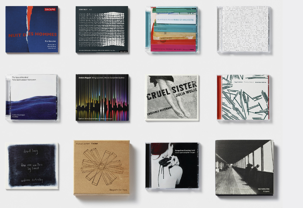
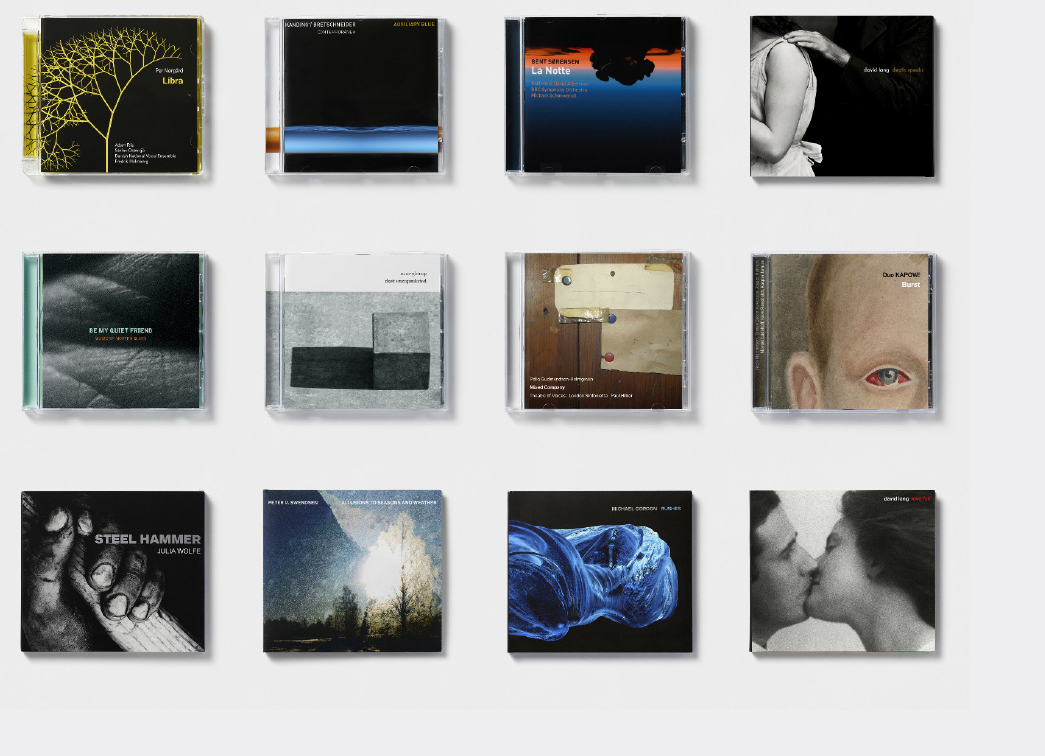
The CD has been – and still is – the main format for recorded music in all the time I’ve been designing. Budgets for releasing art music are famously small, so any deviation from standard formats, such as jewel cases and card wallets, are few and far between.
There is very little space on a CD, so all the available surfaces in the packaging are important. The most important area is, of course, the 120 x 120 mm square of the front cover. The part that shows its face to the world before the CD is opened and the only aspect you tend to see in print or digitally. The cover is the identifier for the music, but the small square doesn’t easily allow for complex visual ideas – it demands something simple and immediate.
I’ve learnt that finding a good solution is a process and you have to trust it. It helps if you are able to listen to others, stand up for your own ideas when challenged, are willing to accept that your impressions are not always right and are prepared to put in extra time when the solution isn’t easily come by. I’m often challenged on all fronts when working with contemporary music, which is probably why it has held my fascination for so many years.
– Denise Burt
Next – INTRODUCTION: Towards the full square