Open music player
Julia Wolfe
Steel Hammer
Cantaloupe Music, 2014
Life of a legend
The design for Julia Wolfe’s Steel Hammer was a case of me trying to meet the composer’s vision, and failing.
Steel Hammer is a vocal work based on the American legend of John Henry – a railway steel-driver in the 1870s – who cuts a tunnel through pure rock with his hammer, in a race against a steam-driven machine. Henry wins the race but collapses and dies. Julia took texts from over 200 versions of the ballad to create her own song texts, collaging them together so that the many variations of the legend are combined in an exploration of storytelling itself.
The figure of John Henry is iconic – he is usually depicted as a highly muscular black man wielding a large hammer. In my mind, the assignment was to show him on the album cover from a different angle. The many variations of descriptions of him in the song text also gave him an ambiguity that I felt I would need to reflect in the design.
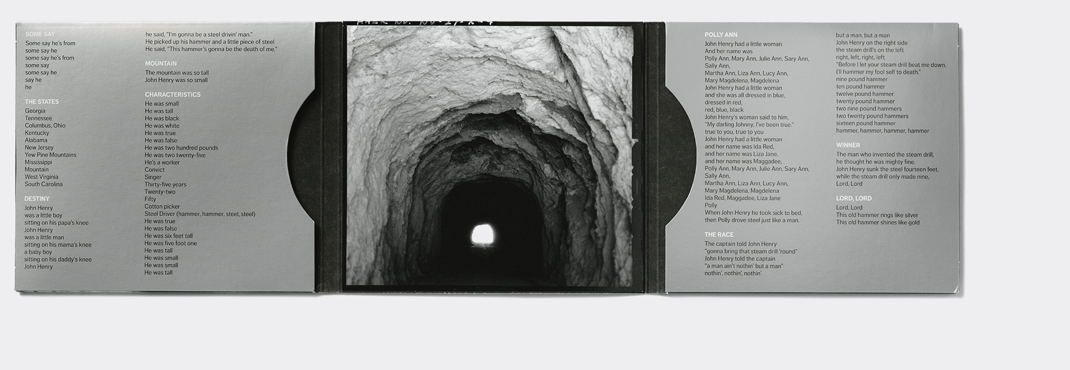
I delved into historical picture archives to find images, especially of railway-related things. The first version of the cover I presented to Julia was a 19th-century photograph of a large rock face, with a hand-hewn tunnel cut into it – Julia found it too dark and also too sexual, which I hadn’t realised but could see was true. She saw her work as somewhat lighter and more playful.
I decided to make a more folky graphic involving illustrative typography and hammers. In all my attempts though, I couldn’t find my way to a style that didn’t feel superficial. I changed my mind again and went back to John Henry and his ‘will of steel’. I presented Julia with a second design of a strong, clenched, working hand in black and white. Julia found it way too dark and a bit confrontational. She was right. She pointed me to the more folk-quality of the piece.
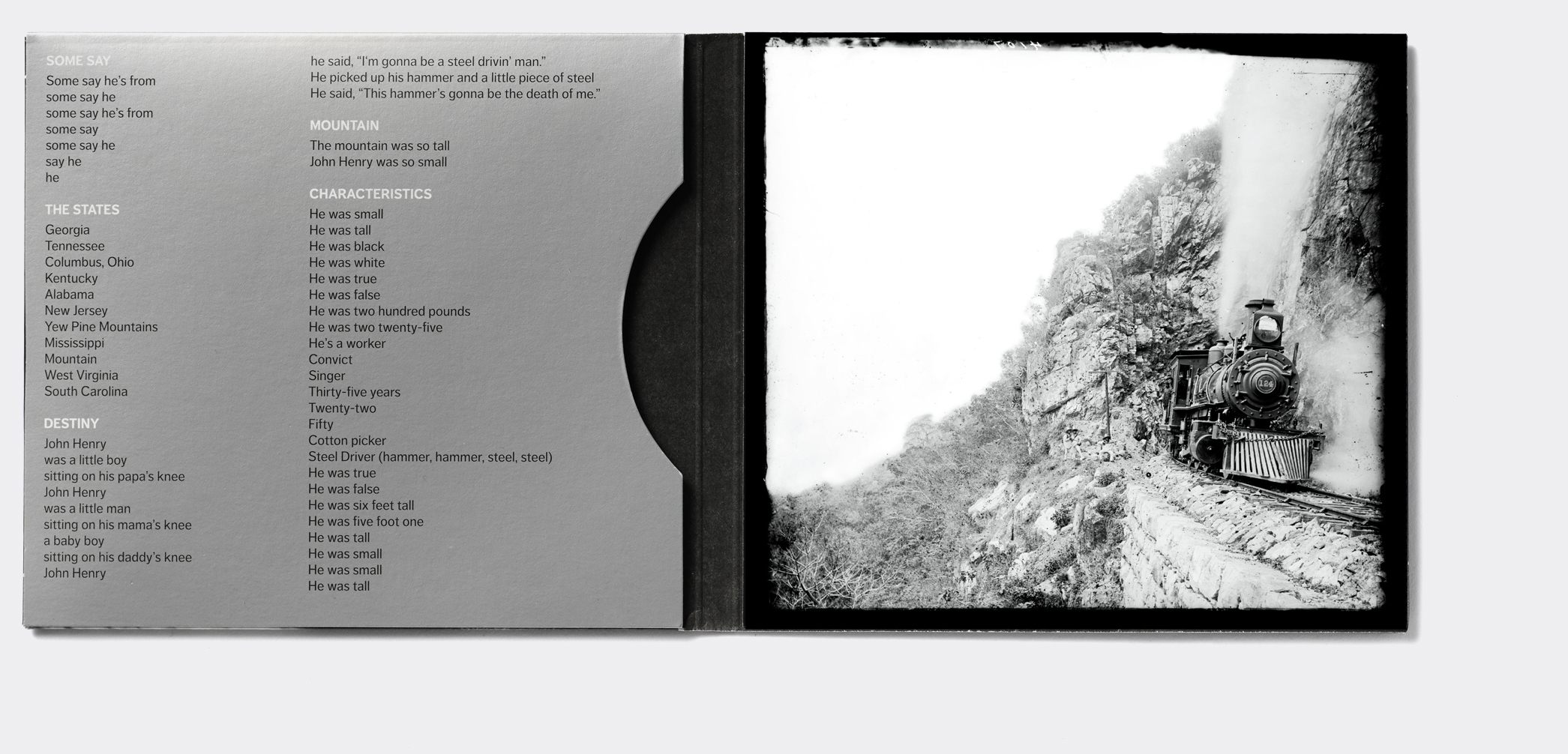
A little desperate now, I continued to explore all manner of American graphics: historical images of railway workers, 19th-century ephemera, catalogues for railway machinery and much more. Admitting to myself that, after hundreds of sketches, I was getting nowhere, I was drawn back to John Henry’s hand – and the hammer.
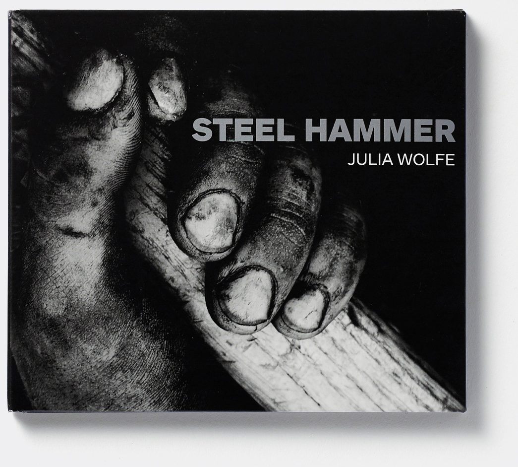
This time I set out on my picture hunt with grim determination and I came up with a commercial stock image of a blacksmith. Inside the picture, was the most beautifully dirty working hand holding the shaft of a hammer. I cropped in tight, made the image monochrome and worked with the contrast to accentuate the dirt and textures.
Unfortunately, I was presenting to Julia the 3rd in a line of very dark and moody designs. She had repeatedly told me she didn’t connect with this approach, so I resigned myself to the 3rd rejection. I was exhausted, a bit like John Henry himself. We agreed to let the project rest a while.
We had come back to the project and started to work with new ideas when Julia wrote to me. To my surprise and delight, she had changed her mind about the third design. ‘Sometimes moving far away from where you start can open your eyes. So my eyes have been opened and I think this is indeed a very powerful cover, and wonderfully gritty!’


